LinkedIn Banner: Ideas, Design Tips and What to Avoid
How to choose or design a LinkedIn banner that supports your profile: ideas by role, layout tips so nothing gets hidden behind your photo, and the privacy details to leave out.
 By Editorial Team
7 min read
By Editorial Team
7 min read
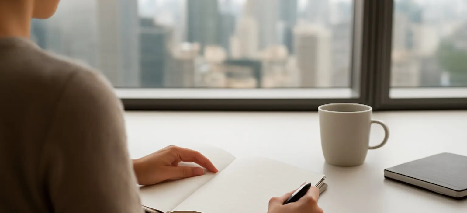
A good LinkedIn banner, the wide background image behind your profile photo, reinforces who you are and what you do in one glance: a clean image related to your work, your company’s branded banner, or a simple design with a short line of text. Keep important text and logos away from the lower-left area, where your profile photo overlaps it, check how it crops on both phone and desktop, and leave out personal details such as your phone number, home or children.
Most people leave LinkedIn’s default blue pattern in place. That isn’t a disaster, but it wastes the largest visual space on your profile. A thoughtful banner takes an hour or less and makes the whole profile look finished.
What your LinkedIn banner is for
The banner sits at the top of your profile and is one of the first things a visitor sees, along with your photo, name and headline. It can do three jobs:
- Signal your field. A courtroom, a lab, a kitchen, a construction site or a stage tells people your world before they read a word.
- Reinforce your message. A short line such as “Helping mid-size manufacturers cut energy costs” backs up your headline.
- Connect you to your company or brand. A branded company banner shows you’re part of a team and makes employee profiles look consistent.
It should support your profile, not compete with it. Your photo and headline still do most of the work. Our guides to LinkedIn profile pictures and LinkedIn headline examples cover those.
LinkedIn banner ideas by role
| Role | Banner ideas |
|---|---|
| Job seeker | A calm image from your field, or a simple design with your specialty (“Supply chain analyst, healthcare logistics”) |
| Employee | Your company’s official LinkedIn banner, if marketing provides one |
| Founder or executive | Your product, team or workplace, or a branded design with your company’s mission line |
| Consultant or freelancer | A short statement of who you help and how, plus your website address |
| Speaker or author | A photo of you speaking, or your book cover and title |
| Creative professional | A strip of your own work, such as design, photography or illustration |
| Tradesperson | A clean photo of a finished project you’re proud of |
If you’re unsure, a simple, high-quality photo related to your field, or even a plain color that matches your personal brand, is better than a cluttered design. Our guide to a personal brand logo covers choosing colors and a simple mark you can reuse here.
How to design a LinkedIn banner, step by step
- Decide the one message. One idea only: your field, your offer, or your company. Not all three.
- Check the current recommended size. LinkedIn publishes recommended dimensions and file limits in its help center. Start from those, since they change, and use a wide image at good resolution so it stays sharp on large screens.
- Use a template or a simple image. Free design tools offer LinkedIn banner templates sized to current guidance. A single strong photo with no text works too.
- Keep key content in the safe zone. Your profile photo overlaps the lower left of the banner on desktop, and phone layouts crop the sides and position the photo differently. Place text and logos toward the center or right, with space around them.
- Keep text short and readable. A few words in a clear font, with strong contrast against the background. On a phone, the banner displays small.
- Use images you have the right to use. Your own photos, your company’s approved assets, or images licensed for this kind of use. Using someone else’s photo without permission can lead to a copyright complaint.
- Upload and preview. Use LinkedIn’s crop tool to adjust, then check your profile on desktop, in the phone app and in a mobile browser.
- Ask someone else to look. A colleague or friend will spot a clipped word or a confusing image faster than you will.
Keep your LinkedIn banner privacy-aware
A banner is public whenever your profile is, and it’s easy to reveal more than you meant to. Before uploading, look for:
- Personal contact details. Leave off your personal phone number and home address. A website or work email is enough, and LinkedIn has its own contact info section with visibility controls.
- Your home or neighborhood. A view from your window, your street or your front door can help someone locate you.
- Children and family. Family photos belong on personal accounts with private settings, not on a public professional profile.
- Screens and documents. Photos of your desk can show client names, emails or dashboards on a monitor.
- Badges, license plates and signs that reveal where you work or park.
- Confidential work. Unreleased products, client sites or internal slides, which your employer may not want public.
Our guide to LinkedIn privacy settings explains how to control who sees the rest of your profile.
Personal banners vs company banners
Many companies give employees a branded LinkedIn banner. Using it is a quick way to look consistent and is often part of an employee advocacy program. It also ties your profile to your employer, which is worth thinking about if you’re job hunting or want your profile to be about your own expertise.
A middle path is a personal banner that fits your field without heavy company branding. That also saves you updating it the day you change jobs. If you manage a company presence, the company page has its own cover image; our guide to LinkedIn business pages covers that separately.
A worked example
This is an illustrative scenario, not a real client.
Oluwaseun is an independent bookkeeper for restaurants. Her banner is LinkedIn’s default pattern, and her headline says “Bookkeeper”. She wants restaurant owners who find her profile to understand what she does quickly.
- She picks one message: “Bookkeeping for independent restaurants.”
- She checks LinkedIn’s current banner guidance and opens a banner template in a free design tool at that size.
- She uses her own photo of a busy restaurant pass, taken at a client’s kitchen with the owner’s permission and no staff faces visible, and darkens it slightly so white text stands out.
- She places the line and her website address on the right, well away from where her profile photo sits.
- She uploads it and previews it on her phone, where the website address is too small to read, so she removes it. It’s in her contact info anyway.
- She updates her headline to match: “Bookkeeper for independent restaurants, monthly books and payroll.”
Not sure where to start?
Get a free audit of your search results and review profiles, with a prioritized fix list.
Get a free auditCommon LinkedIn banner mistakes
- Text hidden behind the profile photo or cut off on mobile.
- Too much text. A banner isn’t a resume. One short line is plenty.
- Blurry or stretched images from uploading something too small.
- Low contrast, such as gray text on a busy photo.
- Generic stock photos that could belong to anyone, such as handshakes and skyline clichés.
- Out-of-date information, such as an old employer’s logo, an expired event or a job title you no longer hold.
- Claims you can’t back up. “Award-winning” or “number one” in a banner invites people to check.
How the banner fits your wider reputation
Your banner, photo, headline and About section work together, and they work best when they match what people find elsewhere when they search your name: your website, your company bio and your other profiles. Our guide on making your social media professional covers the other platforms, and our personal branding guide covers the bigger picture. If your name search shows something you’d rather it didn’t, our personal reputation management team can help, and we’ll be honest about what can change.
Frequently asked questions
What size is a LinkedIn banner?
LinkedIn publishes its current recommended banner dimensions and file limits in its help center. Check there before designing, because they can change, and use a wide, good-resolution image so it stays sharp on large screens.
What should I put on my LinkedIn banner?
Pick one message: an image from your field, your company’s official banner, or a short line about who you help. Keep text brief, readable on a phone, and clear of the area covered by your profile photo.
Why is my LinkedIn banner cut off?
LinkedIn crops the banner differently on desktop, the mobile app and mobile browsers, and your profile photo covers part of it. Keep important text and logos toward the center or right, and preview on each device after uploading.
Should I use my company's LinkedIn banner?
If your employer provides one, it’s a quick way to look consistent and support the company. If you’re job hunting or want your profile focused on your own expertise, a personal banner that fits your field may suit you better.